
Difficult-ish podcast page
difficult-ish is a podcast focused on deconstructing the narrative of what it means to grow up in a South Asian/Desi household, and building the idea back together using blocks from two different journeys. They speak upon taboo topics in the South Asian/Desi community including mental health, independence, creativity, and identity enrichment, while never forgetting to keep things silly and light-hearted, just to show how understanding these ideas may not be as difficult as we believe. This project contains an episode categories page, articles and resources, and other aspects related to the podcast for both desktop and mobile formats.
Tools
Figma
Adobe Photoshop
Adobe Illustrator
My Role
User research and competitive analysis
Creating User persona
Empathy map
Customer journey map
Wireframes and prototypes
Mock-up and visual designs
Timeline
Overall: 4 weeks
Discovery & Research: 2 weeks
Design & testing: 2 weeks
Step 1: Empathize
Develop a deep understanding of the target audience/customer/consumer and their unique perspective to identify and address the problem at hand
User Interviews
As a foundational component of UX research and design, these interviews played crucial role in uncovering user insights, validating ideas, and ultimately creating products that meet user needs and deliver exceptional experiences.
User Personas
I wanted to form a deeper understanding of my users' goals, needs, experiences, and behaviors. So, I created 4 personas for each of our user segments. They were based on user interviews and surveys, and I kept updating them throughout the project as we gathered more data. I used these personas whenever I wanted to step out of ourselves and reconsider the initial ideas. Here is an example of one of the personas.

Step 2: Define
Define the problem statement clearly - the ideal problem statement captures the perspective of human-centered needs rather than focused on business goals
Problem Statement
Based on my interview responses, I found that many users felt frustrated that the podcast they were listening to did not have a website to easily access podcast episodes, or contain audio/videos that were indexed and organized based on certain categories. They also wanted to engage more with the content and find resources that the speakers referenced.
How might we create a podcast website that allows listeners to stay continuously inspired/engaged with the episodes and easily access everything in one place that helps build a stronger sense of community?
Step 3: Ideate
Brainstorm ways to address those unmet needs found in the problem statement, create drawings, and low-fidelity wireframes
The Solution
Create a podcast website that is both desktop and mobile friendly that engages listeners and users by organizing podcast episodes based on certain topics, easily being able to access podcast episodes, access articles and resources related to the episodes, and builds a community.
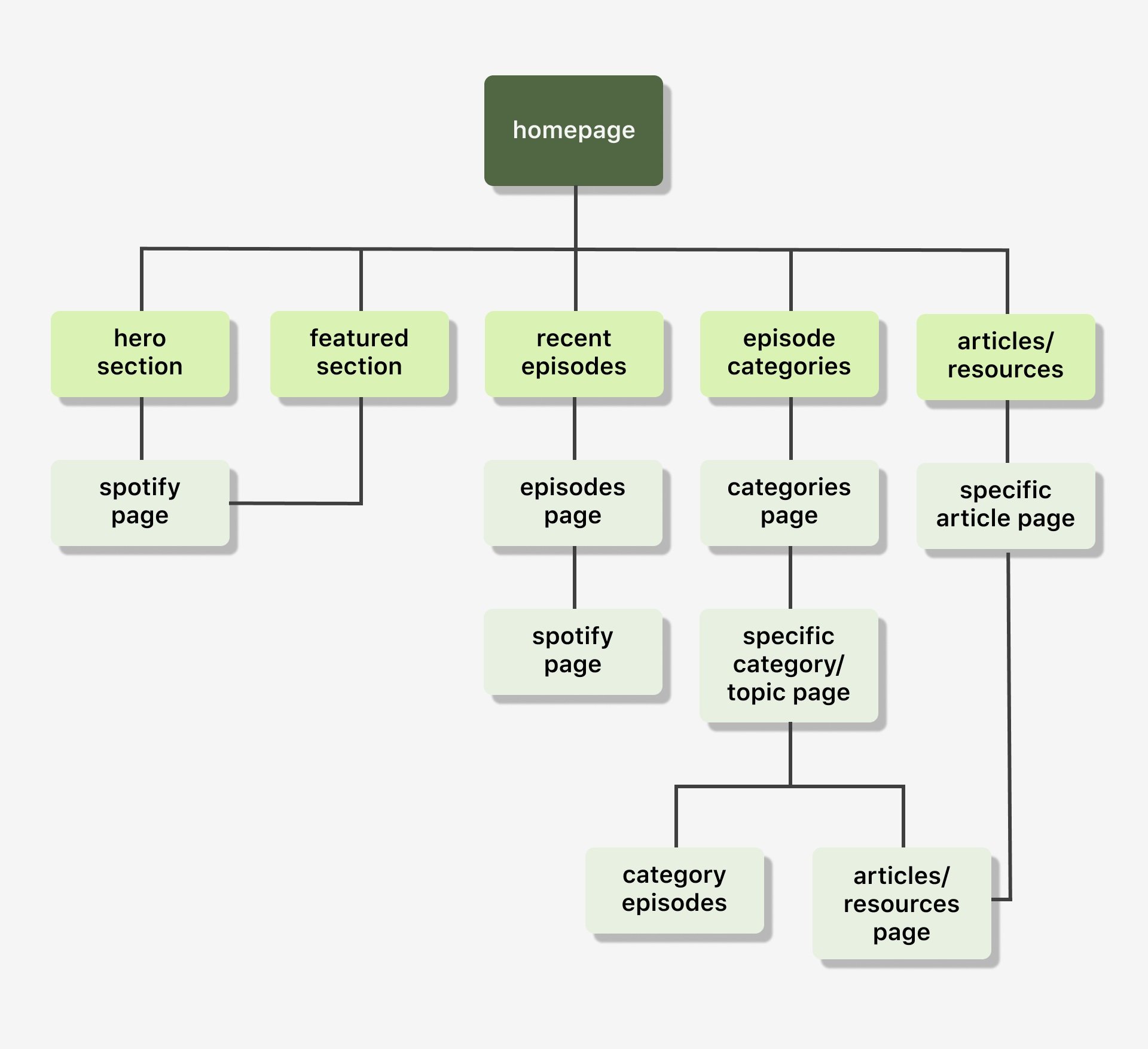
The User flow
Once I knew the direction I wanted to go in based on both market and user research, I began curating my page layout.
Some sketches…
I began the design process with low-fidelity sketches and wireframes to accelerate decision-making through visualization without losing time. My sketches were based on the initial user interviews and the goal of the website itself. I came back to the sketches throughout the entire design process to make sure that I didn't lose sight of our primary goals and ideas.
By looking through the summaries and titles of the 103 episodes the podcast had at the time, I came up with 16 different categories that they can fall under.


Wireframes


Using Figma, I translated my first sketches into low-fidelity wireframes. Then, I improved them by adding a few relevant stock images and copies that I got from my research process - for both the desktop and mobile versions.
Laptop + Mobile screens


Component Sheet for the mindflow identity and app
The Final Prototype!
Mobile Screens
Step 4: Prototype
Turn my ideas from Stage 3 into Prototypes so that it can be tested on real users
Once the usability issues were resolved, I moved on to design the final screens in Figma. My goal was to create a visual identity that’s aligned with the difficult-ish values.
I went with a color theme of green, red, yellow, and creme to suit the colors of South Asia since that is the major demographic of the podcast listeners.
I made sure to follow the Web AAA's accessibility guidelines and made sure the contrast of the colors passed the test and the text size was large enough.
I included images that relate to the corresponding podcast topics to improve engagement and visuals.


Prototype walkthrough of the difficult-ish site for both desktop and mobile
Next steps
Normally, usability testing would be done at this stage but because I was running out of time, I instead reached out for a group critique and got feedback from peer designers about my prototype.
Throughout this entire project, I learned a lot about taking an existing product and improving it in ways after learning more about the user, target audience, and the the intentions of the product maker (in this case, the podcasters). There was a lot of research and preliminary writing and sketches that had to take place before making the actual design. Additionally, in this project I had to work with designing for both a desktop and mobile format, so it was important to carefully consider all elements of the product and if there is an intention behind it.

