mindflow email campaign
The task at hand was to identify a business client and design a series of four (4) emails for them. Come up with a product these users have trialed. The goal was to convert them from trial users into buyers.
mindflow is an online platform dedicated to promoting emotional wellness through journaling, which is an extension of the app created and designed in one of the other case studies.
Tools
Figma
Adobe Photoshop
Adobe Illustrator
My Role
User research and competitive analysis
Creating User persona
Empathy map
Customer journey map
Wireframes and prototypes
Mock-up and visual designs
Timeline
Overall: 4 weeks
Discovery & Research: 2 weeks
Design & testing: 2 weeks
Step 1: Empathize
Develop a deep understanding of the target audience/customer/consumer and their unique perspective to identify and address the problem at hand


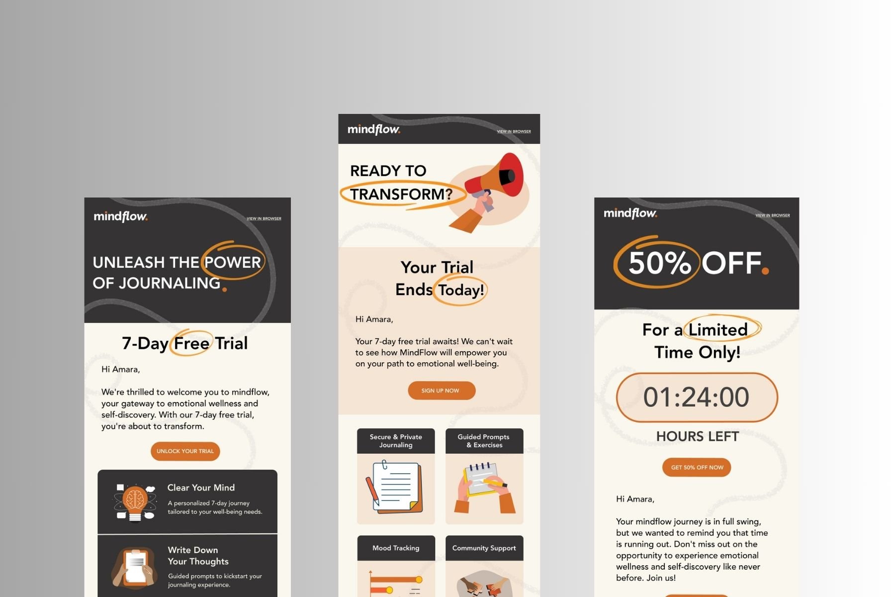
Email 1
The purpose of this email was to offer a free trial to a visitor to convert them into a buyer.
User Interviews
As a foundational component of UX research and design, these interviews played crucial role in uncovering user insights, validating ideas, and ultimately creating products that meet user needs and deliver exceptional experiences.
User Personas
We wanted to form a deeper understanding of our users' goals, needs, experiences, and behaviors. So, we created 4 personas for each of our user segments. They were based on user interviews and surveys, and we kept updating them throughout the project as we gathered more data. We used these personas whenever we wanted to step out of ourselves and reconsider our initial ideas. These personas are similar to the mindflow app.

Step 2: Define
Define the problem statement clearly - the ideal problem statement captures the perspective of human-centered needs rather than focused on business goals
Email #1 - Free Trial
Problem Statement
How may we design an engaging webpage that converts a trial user to a buyer and make them stay?
Step 3: Ideate
Brainstorm ways to address those unmet needs found in the problem statement, create drawings, and low-fidelity wireframes
The Solution
Following the design of the mindflow app, it is important to make an inclusive email campaign that is intentional in each design with the right copy to convert a trial user to a buyer.
Some sketches…
I began the design process with low-fidelity sketches and wireframes to accelerate decision-making through visualization without losing time. I started out by brainstorming a logo for the app, and what I want reflected on each email sent out to customers. I came up with:
Email 1: Try our service for Free for 7 days
Email 2: Free trial ended, sign up
Email 3: No sign up? Offer a Discount
Email 4: They are a member; what their membership level gets them


Branding Ideation
While coming up with the design of the brand and the logo, I ended up having many iterations. I wanted the logo to represent a seamless flow of thoughts and emotions into a journaling process that offers wellness and engagement.

Wireframes


Email 2
Letting the trial user know that they need to sign up if they want to continue the benefits they experienced in the free version.
Using Figma, I translated my first sketches into low-fidelity wireframes. Then, I improved them by adding a few relevant stock images and copies provided by the marketing team. At this stage, the wireframes were defined enough for some user testing.
I wanted the emails to be bold and attract the attention of the potential buyer.

Email 3
After a user still hasn't signed up, this email would be sent to offer a further discount.
Component Sheet for the mindflow email campaign

Email #2 - Sign up
Email #2 - Sign Up

Mobile Screens
Step 4: Prototype

Email 4
This email is sent to people who did sign up and are members of the mindflow app; it is an additional offer that is exclusively for members
Turn my ideas from Stage 3 into Prototypes so that it can be tested on real users
Once the usability issues were resolved, I moved on to design the final screens in Figma. My goal was to create a visual identity that’s aligned with the brand’s values and message in addition to keeping it consistent with the theme of the app.

Email #1 - Free Trial


Prototype walkthrough of the difficult-ish site for both desktop and mobile
Next steps
Normally, usability testing would be done at this stage but because I was running out of time, I instead reached out for a group critique and got feedback from peer designers about my prototype.
Throughout this entire project, I learned a lot about taking an existing product and improving it in ways after learning more about the user, target audience, and the the intentions of the product maker (in this case, the podcasters). There was a lot of research and preliminary writing and sketches that had to take place before making the actual design. Additionally, in this project I had to work with designing for both a desktop and mobile format, so it was important to carefully consider all elements of the product and if there is an intention behind it.
